A business owner opens the company website on a phone before sending its address to a potential customer. The photographs look fine, but the service description needs pinching to read, the menu is awkward, and the enquiry button has slipped beneath a large banner. On a laptop, none of these problems was obvious.
That's the practical reason to understand mobile responsive web design. A website hasn't succeeded because its contents fit inside a phone screen. A visitor needs to understand the service, decide whether it suits their needs, and complete an enquiry without fighting the interface.
Table of Contents
What a Mobile Responsive Web Actually Is
A visitor looking for a local electrician opens a desktop-style page on a phone. The text runs beyond the screen, a navigation menu is squeezed into the corner, and reaching the contact form means repeated zooming. The information exists, but using it is hard work.
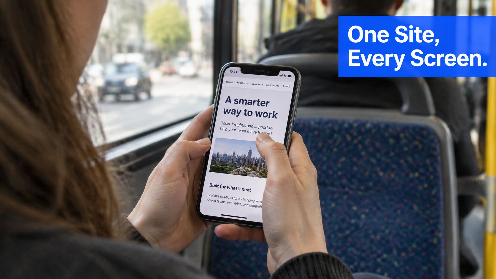
A mobile responsive website is one site at one address, with shared HTML and CSS that rearrange its presentation to suit the available screen space. HTML describes the content and structure; CSS controls its appearance. The business doesn't need a separately maintained phone version.
Water provides a useful analogy. It takes the shape of its container rather than keeping the shape of the jug it came from. Likewise, a page should fill a narrow phone screen or a wide monitor without requiring its content to be rebuilt.
The working parts behind the change
Responsive design combines several ordinary building techniques:
- Flexible grids allocate space proportionally, rather than forcing every column to remain a fixed width.
- Flexible images shrink within their containers without pushing neighbouring content beyond the screen.
- CSS media queries change presentation when the available width reaches a point where another arrangement works better.
For the electrician's page, a photograph and service description might sit alongside each other on a desktop. On a phone, they stack vertically, leaving enough room for readable text and an obvious enquiry action.
GOV.UK adopted responsive design as mobile use grew, and by July 2020 more than half its users consistently accessed the service on mobile devices, according to the Government Digital Service's account of improving the mobile experience. That history illustrates why responsiveness concerns completing practical tasks, not merely producing attractive screenshots.
Practical rule: The arrangement can change between screens, but the visitor's ability to get something done shouldn't disappear.
The same principle applies beyond conventional business pages. Splash Access's explanation of mobile-friendly guest Wi-Fi portals offers another context where someone on a phone needs a usable interface before proceeding.
For a business owner, the most revealing check is still an actual enquiry completed on an actual phone, including confirmation that the message arrives.
Why Phones Now Shape Most UK Web Visits
Smartphones accounted for 75% of UK adults' daily online time in May 2024, when 47.4 million adults accessed the internet using smartphones, tablets or computers, according to Ofcom's Online Nation 2024 report, using Ipsos iris data.
That measures time online, not the proportion of visits to every business website. It doesn't establish the device mix for an individual plumber, dental practice or consultancy. A business's own visitor records remain the appropriate place to check that.
The practical implication is nevertheless clear: treating the phone presentation as a secondary version creates an unnecessary risk. Customers can encounter a business while travelling, between appointments or away from a desk. They shouldn't need to return on a computer before making contact.
A service page through a customer's eyes
Consider a plumber's homepage with a large decorative banner. On a desktop, the banner sits beside an explanation of emergency repairs and a telephone number. On a phone, the banner fills the opening screen, while the service details and contact action sit further down.
Nothing is technically missing. Yet someone dealing with a leak has to investigate before discovering whether the plumber covers the area or accepts urgent calls.
A more useful opening gives the visitor a clear service description, relevant location information and a direct contact route. The photograph can still support the business's credibility without occupying all the immediately available space.
A phone layout should reflect the customer's immediate decision, not the desktop design's spare space.
This doesn't mean every business needs a permanently fixed call button. An accountant may need to explain the type of client served before inviting an appointment. A garden contractor may need to distinguish maintenance work from larger projects. Priority should follow the enquiry, rather than a universal template.
Inclusion changes the brief
Some customers don't have another convenient device available. The Mobile UK digital-inclusion report states that 21% of adults access the internet only through a smartphone.
For those visitors, a difficult mobile form isn't a minor inconvenience that can automatically be resolved later on a laptop. It may prevent the enquiry altogether.
A phone-first review should therefore establish whether these essentials are easy to find and use:
- The telephone number, including a working tap-to-call action where appropriate.
- The main service, expressed plainly enough for someone unfamiliar with the business.
- The contact form, with a clear explanation of what happens after submission.
These checks make the phone presentation a complete route to service, rather than a preview of the desktop site.
How Layouts Adapt Across Screen Sizes
A fluid grid lets sections share the available space. Instead of insisting that a service card always occupies a fixed width, the layout allows cards to grow, shrink or move onto another row. CSS Grid and Flexbox are common ways developers arrange these relationships.
A media query applies CSS under particular conditions, such as when the browser becomes wide enough for an additional column. The width at which the arrangement changes is called a breakpoint. Between breakpoints, the layout should still resize smoothly.
Breakpoints should follow the content
A navigation bar needs to change when its labels no longer fit comfortably, not merely when the browser matches a familiar phone model. Longer business names, enlarged text and translated content can all change that point.
The DOM Studio breakpoint strategy guide provides a useful companion for understanding breakpoint decisions. The central practical test remains the content itself: headings shouldn't collide, buttons shouldn't become cramped, and text shouldn't need sideways panning.
Typical screen widths and layout responses
| Screen type |
Common layout response |
| Small phone |
Single column, stacked menu |
| Standard phone |
Single column, large tap targets |
| Tablet portrait |
Two columns where content remains comfortable, simplified navigation |
| Tablet landscape or small laptop |
Multi-column layout, full navigation when labels fit |
| Standard laptop or desktop |
Full grid, sidebars where useful |
| Large desktop |
Capped content width, extra whitespace |
These are layout guides, not prescribed device boundaries. No universal width range can determine whether a particular business's navigation or enquiry form has enough room. A tablet can also have a narrow browser window, while a phone turned sideways offers a different shape without becoming a desktop computer.
Building outward from the narrow layout
A mobile-first implementation begins with a complete narrow-screen page. Additional columns and more spacious arrangements appear only when room allows. This helps avoid the habit of solving desktop overcrowding by hiding useful information on phones.
For a building contractor, the narrow layout might present the service explanation, project photographs and enquiry form in a meaningful reading order. A wider layout can place selected elements alongside each other without changing that underlying order.
The browser also needs the viewport meta tag in the page head, configured with width=device-width, initial-scale=1. This tells a phone browser to use the device's layout width rather than displaying a scaled-down desktop-style viewport. Without the correct viewport setting, width-based rules may not behave as intended.
Before visual decoration, the developer should inventory the page's essential elements:
- Content: headings, descriptions, prices where applicable, and service-area information.
- Controls: navigation, telephone links, form fields and submission buttons.
- Supporting material: photographs, testimonials, documents and directions.
Each needs checking at the narrowest supported layout, with ordinary content rather than unusually short placeholder text. A broader guide to designing a business web page can help connect those layout decisions to the information customers need before enquiring.
The aim isn't to fill every available space. It's to preserve a clear reading order and a usable next action as the space changes.
Responsive, Adaptive or Separate Mobile Sites Compared
A phone-friendly appearance doesn't reveal how a site was built. Similar-looking pages can come from a shared responsive layout, device-specific templates or an entirely separate mobile website. The distinction matters when services, opening hours or contact details change.
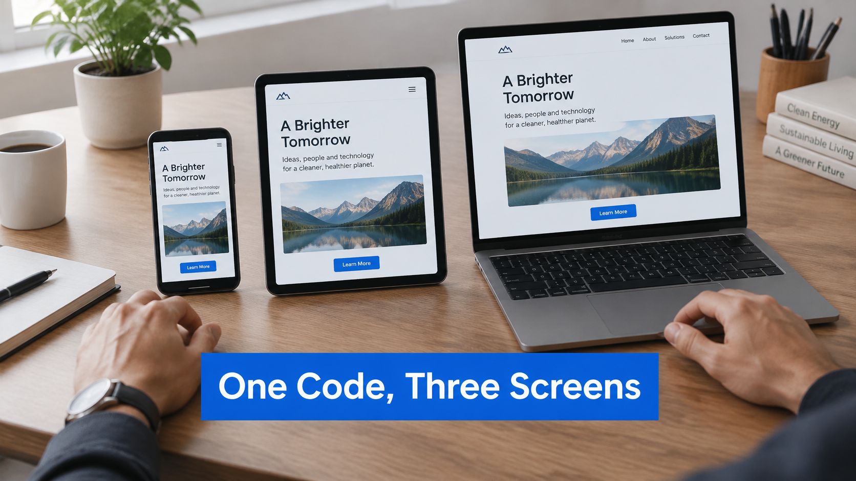
Responsive design is usually the sensible starting point for a small business or service website. It provides a shared content structure without requiring the owner to manage a separate phone edition.
The maintenance trade-offs
Three ways to serve phone and desktop visitors
| Approach |
How it works |
Upkeep |
Suits |
| Responsive design |
One set of HTML and CSS adapts the layout to screen width |
One site to update |
Most small business and service websites |
| Adaptive design |
Server selects fixed layouts for device classes |
Separate templates to maintain |
Large sites needing device-specific features |
| Separate mobile site |
Own addresses, often a mobile subdomain |
Two sites kept in sync |
Legacy sites part way through migration |
An adaptive implementation can suit an application with different device requirements. Its developers may need tightly controlled interfaces for distinct environments. That control comes with additional template work and more combinations to test.
A separate mobile site creates another maintenance obligation. A changed service description can be correct on the main site but outdated on the phone version unless the publishing system keeps them synchronised. Parallel addresses also require careful handling so visitors and search systems reach the intended version.
Responsive design avoids that particular split, but it doesn't remove all maintenance. A newly added photograph, longer menu label or embedded booking form can still disturb an otherwise sound layout.
A builder can still be a reasonable choice
Responsive describes behaviour, not a purchasing category. Both a hand-built website and a website-builder template can use responsive techniques. Neither should be accepted solely on the strength of that label.
For a straightforward brochure site, a suitable builder may provide everything the business needs. The trade-off is usually between convenience, control over unusual requirements, and the owner's willingness to maintain the content and check the result.
A custom build becomes more relevant when a business needs carefully structured service journeys, unusual integrations or close control over performance and publishing. It isn't automatically necessary for a short site with simple information.
The useful question for any proposed setup is whether the same address and substantive content serve every screen. The answer should be demonstrated with a real service page and a working enquiry, not just a homepage preview.
An attractive phone screenshot proves appearance at that moment. It doesn't establish how updates, validation messages or longer content will behave.
Common Mobile Faults and How to Fix Them
Sideways scrolling is a serious warning sign. A visitor trying to read a service description shouldn't have to move the whole page from side to side. A fixed-width image, table or embedded element can push an otherwise responsive page beyond its container.
A page can also fit perfectly while remaining difficult to use. Small controls, hover-only menus and forms that discard a carefully written message are interaction problems, not merely layout problems.
Matching symptoms to repairs
Phone symptoms, causes and fixes
| Symptom on a phone |
Likely cause |
Fix |
| Sideways scrolling |
Fixed-width images, tables or containers |
Constrain images and containers to their available width; place genuinely wide tables in a labelled scrollable region |
| Buttons hard to tap |
Small targets crowded together |
Enlarge the clickable area and separate neighbouring controls |
| Text too small to read |
Undersized type or restrictive sizing rules |
Use relative font units, comfortable line spacing and layouts that tolerate enlargement |
| Menu opens only on hover |
Hover-only navigation |
Use a tap-toggled menu that also works with a keyboard |
| Form input lost or unclear |
Missing labels, vague errors or reset fields |
Provide visible labels, specific nearby errors and retained entries after validation |
| Page slow to become usable |
Oversized images and blocking scripts |
Optimise images, reserve their space and defer non-essential scripts |
| Content hidden by a banner |
Oversized consent overlay |
Use a compact, accessible notice with clear choices that don't obscure the task |
Relative font units help support flexible sizing, but pixel units alone don't prove that a page is inaccessible. The meaningful test is whether text can be enlarged and read without clipping, overlap or lost controls.
Likewise, a menu button isn't enough by itself. It needs an accessible name, an understandable open state and predictable keyboard behaviour. Closing the menu shouldn't leave keyboard focus stranded somewhere invisible.
Accessibility belongs in the ordinary build
GOV.UK's mobile technology guidance couples responsive design with progressive enhancement and access to the same content and functionality; the public-sector accessibility baseline is WCAG 2.2 AA, including contrast ratios of 4.5:1 for normal text and 3:1 for large text.
Those public-sector requirements shouldn't be presented as a blanket statement of every commercial business's legal obligations. The engineering principles are nevertheless useful for commercial sites: properly associated form labels, visible focus indicators, keyboard-operable controls and content that reflows when enlarged.
A useful distinction: Responsive CSS can rearrange a form, but it can't compensate for missing labels or an error message that never explains the problem.
Automated checks can identify some faults. Human testing still needs to include keyboard navigation, enlarged text, screen-reader use and real-device interaction.
An owner assessing signs that a business needs a new website should distinguish isolated repairs from repeated structural problems. A troublesome image may need a small correction; a template that prevents basic access across several pages needs broader attention.
Sideways overflow and hard-to-hit primary controls are sensible early repairs because they can obstruct the enquiry directly. The next priority is ensuring that someone who makes a form error can recover without starting again.
Building for Slow Connections and Every Visitor
Across more than 225 million tests between August 2025 and July 2026, 81% met the proposed good mobile-performance thresholds, with England at 82%, Northern Ireland at 81%, Scotland at 79% and Wales at 76%, according to Ofcom's Mobile Matters 2026 report.
These are network-performance results, not website failure rates. They do, however, provide a strong reason not to judge a business page solely on a fast office connection.
A phone visitor may have an inconsistent signal, limited device resources or a third-party script that doesn't finish loading. Resilient responsiveness means preserving the useful task under those conditions, rather than displaying an empty shell until every enhancement is ready.
What deserves to load first
For a local service business, the priority is practical information: the telephone number, opening hours, service area, useful pricing context, directions and enquiry form. Decorative video, animation, tracking and chat widgets shouldn't be prerequisites for accessing those essentials.
The build can support that order through specific choices:
- Core content in the initial HTML: Server-rendered information remains available without waiting for client-side scripts to assemble the page.
- Appropriately sized images: AVIF or WebP versions can reduce unnecessary downloads when supported and properly configured.
- Reserved image space: Intrinsic dimensions help prevent text and controls from jumping as photographs arrive.
- Deferred enhancements: Non-critical scripts load without holding up the main reading and enquiry journey.
Mobile-first CSS keeps the baseline presentation straightforward. Progressive enhancement then adds richer behaviour without making the basic service dependent on it.
Testing failure conditions deliberately
A useful test includes both a lower-powered handset and a restricted connection. Browser network throttling offers controlled checks, while real mobile-data use exposes conditions that a desktop preview can miss.
| Test condition |
What should remain usable |
What indicates a failure |
| Throttled connection |
Service explanation, contact details and primary controls |
Blank content or controls blocked by optional scripts |
| Images disabled |
Meaningful headings, useful text and understandable actions |
Essential instructions available only inside pictures |
| Submission interrupted |
Clear failure feedback and a safe retry route |
False success, lost entries or an unexplained frozen button |
An interrupted submission deserves particular care. A form mustn't claim success before the server accepts the enquiry, and retrying should avoid accidental duplicate messages where possible.
For private or sensitive enquiries, recovery also needs restraint. Keeping information on the current page can help, but storing personal details on a shared device creates another problem.
The standard is practical: someone with imperfect connectivity should still understand the service, find an alternative contact route and know whether an enquiry was sent.
Test Your Own Site on a Phone This Week
A business owner can begin with a short check using the live site, rather than a design preview. A simple record of symptoms is more useful than a general judgement that the mobile version feels awkward.
- Use mobile data. The owner opens the site on a phone away from the office connection and notes anything that remains blank or unresponsive.
- Inspect the opening screen. The main service and telephone route should be easy to identify without searching through decorative content.
- Send a genuine test enquiry. The message should arrive at the intended destination, and the sender should receive clear on-page confirmation.
- Rotate the phone. Changing orientation and enlarging text can reveal clipped labels, overlapping controls or whole-page sideways scrolling.
- Record each failure by symptom. A note such as “submit button hidden behind banner” gives a developer something concrete to reproduce.
Turning observations into decisions
Repeatable conditions help distinguish a genuine repair from a lucky successful attempt. For teams checking multiple browser environments, Clearcote Labs' discussion of reproducible browser identities across runs provides context for making comparisons consistently.
Once access problems are resolved, conversion rate optimisation addresses a different question: whether the wording, placement and sequence help a suitable visitor decide to enquire.
Operosus offers a free website review covering speed on a phone, the search basics, the searches a site already appears for, and what an AI assistant tells customers about the business. That provides one option for investigating the findings rather than guessing which change matters most.
A small brochure site may still be well served by a website builder. Observed problems and business requirements should determine the choice, not the assumption that every mobile fault requires a complete rebuild.
Operosus builds small business websites by hand, designed to be found on Google and bring in enquiries. A business struggling with its phone enquiry journey can visit Operosus to request a free website review and establish which problems need attention.
